- All Metro signage will continue to use Helvetica
- In 2025, Metro transitioned to the latest version of Helvetica, which is called Helvetica Now
- The new wayfinding signage uses the medium weight of Helvetica Now, which is the same weight used by Massimo Vignelli in the original 1970 Metro design manual
Wayfinding design FAQs
Updated: 9/16/2026
- Signs that hang over the third rail are time-consuming to update and can't realistically be kept up to date with service changes
- Moving the service details (like destinations) onto the platform (pylons, overhead signs, and digital screens) will:
- Make it easier for Metro to maintain accurate information in a timely manner systemwide
- Bring information closer to customers, which is particularly important for low-vision riders
- Terminal information will always be placed where customers generally need it most — at the top and bottom of escalators and elevators
- Metro first began labeling exits with letters in 2023
- Since then, the exit labels have been rolled out at multiple stations and are integrated into trip planning apps such as Metro Pulse and Google Maps
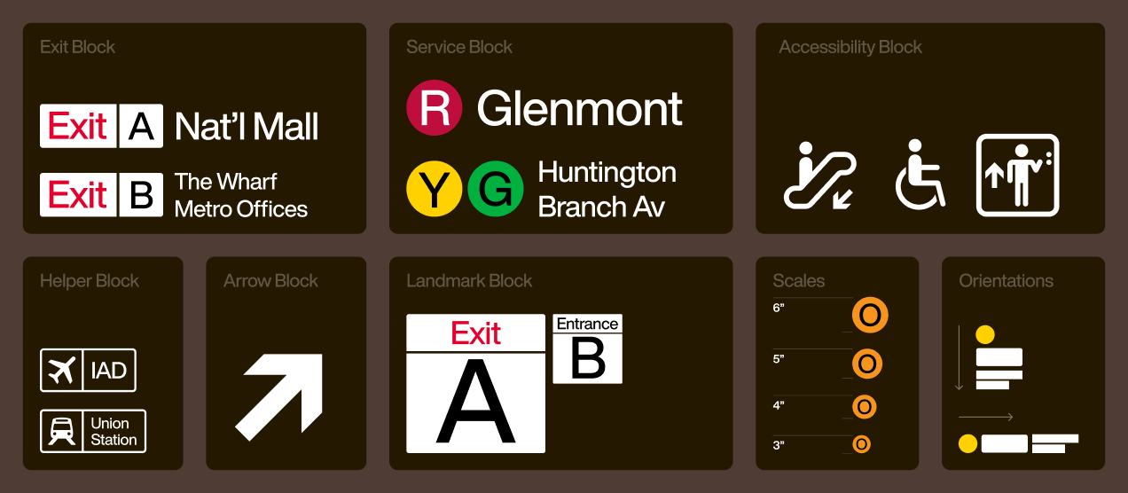
- Consistently labeling ADA-accessible exits with the letter “A” creates a useful association that can help elevator users find their preferred exit
- Moving from stripes to rail discs improves the usability of the pylons, restores more of their original look, and aligns the pylons with all other signs and digital tools in the system which use colored discs
- The stripes on station entrance pylons are difficult for low-vision customers to decipher
- The stripes were not part of the original design system created by Metro branding designer Massimo Vignelli, who exclusively used colored discs to represent rail service
- Metro conducted multiple customer surveys over the past three years, gathering feedback from both local residents and visitors
- In total, over 13,000 customers submitted feedback
- Usability testing was also performed using a virtual reality model of the L'Enfant Plaza station
- The proposed designs were presented multiple times to the Accessibility Advisory Committee, the Riders' Advisory Council, and the U.S. Commission of Fine Arts
- Feedback will continue to be collected in order to improve the system as it is rolled out in additional stations
- Customers have multiple touchpoints to help plan and navigate their trip: station entrance pylons, system maps, overhead signage, station ahead maps, Rider Tools, mobile app Metro Pulse, digital real-time displays, as well as announcements and signs on incoming trains
- By grouping interlined service together, customers can quickly choose their train platform by identifying their desired destination or a key landmark like an airport
- Metro first added letters to its rail service discs in the 1990s to align with accessibility best practices
- In 2025, the abbreviations were changed from two letters to one
- The discs have been further refined to use the same weight of Helvetica as is used elsewhere on the signs
- The letters appear in either black or white, depending on which text color provides greater contrast against the color of the disc
- By default, points of interest are listed alongside exit labels
- One to three points of interest are included for each exit, depending on how much space is available
- On center platform stations (such as the lower level at L'Enfant Plaza) customers face the center of the platform when they exit a train — points of interest will be listed on overhead and platform signage
- On side platform stations (such as the upper level at L'Enfant Plaza) customers face the vault walls when they exit a train — points of interest will be listed on vault wall signage
- Signs will be placed alongside station entrances, corridors, elevators, escalators, and platforms based on what information customers need to make their next navigational decision
- At the top and bottom of escalators, customers will be presented with terminal destinations and station ahead maps to help them select a platform
- When customers step off a train, or before they board an escalator, they will be presented with transfer information, exits, and points of interest
- The new system:
- Uses the concept of progressive disclosure to give customers the information they need exactly at the moment they need it
- Showcases information (to the greatest extent possible) directly in the path of travel, reducing the need for customers to scan left and right
- When testing customer performance using cardinal directions, results improved on lines that ran primarily in a straight path (Yellow and Green), but accuracy declined on lines that required multiple turns (Red and Blue)
- The new wayfinding system enables the inclusion of orienting information such as airports, states, key transfer stations, and landmarks like the National Mall to help customers identify train direction
- This orienting information will be added on a platform-by-platform basis as determined by the location of a given station and common destinations from that station
Want more information?
Call or text:
202-GO-METRO (202-466-3876)
TTY 202-962-2033
Or, chat with us.
Live Customer Support: Monday - Friday, 7 am - 8 pm; Saturday - Sunday, 8 am - 8 pm.